Intro:
Let’s be honest: data analysis can be a frustrating process. You have a spreadsheet full of valuable information, but turning it into a clear, presentation-ready chart can feel like a battle against complex software, endless menus, and formatting options. What if you could skip all that?
This is the promise of DatumFuse.AI, an innovative new tool that transforms a raw CSV file into a stunning, insightful chart in just ten seconds. This isn’t just about saving time; it’s about fundamentally changing how we interact with our data.
The Problem: The Manual Grind of Chart Creation
Traditionally, creating a single chart involves a tedious workflow:
- Open a complex tool like Excel or a BI platform.
- Select the correct columns and rows.
- Guess which chart type (bar, line, pie?) will best represent the data.
- Format the titles, axes, colors, and labels to make it look professional.
This process can take minutes, or even hours, for a single visualization. It’s time spent on manual labor, not on strategic thinking.
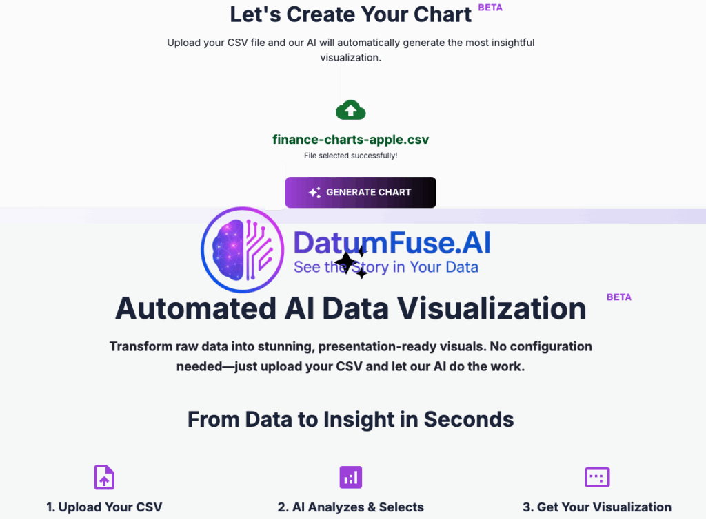
The Solution: Zero-Configuration, AI-Powered Visualization
DatumFuse.AI’s Automated AI Data Visualization tool eliminates this entire process. Its standout feature is its zero-configuration requirement. You don’t need to be a data visualization expert, because the AI is.
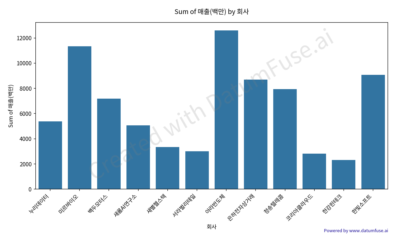
The sophisticated engine analyzes your dataset’s structure, identifies the key relationships, and automatically generates the most appropriate and effective chart type. It removes the guesswork and saves you from the frustrating cycle of trial and error.
Use Case: The Last-Minute Meeting
Imagine you’re a marketing manager about to present quarterly sales figures. The meeting is in 10 minutes, and you just received the final CSV with thousands of rows.
- The Old Way: Panic. Frantically try to build a pivot chart, hoping it looks right.
- The DatumFuse.ai Way: Drag and drop the CSV file. Within seconds, the AI generates a polished, insightful chart highlighting key sales trends. You walk into the meeting calm and prepared, ready to discuss strategy, not to apologize for a messy visual.
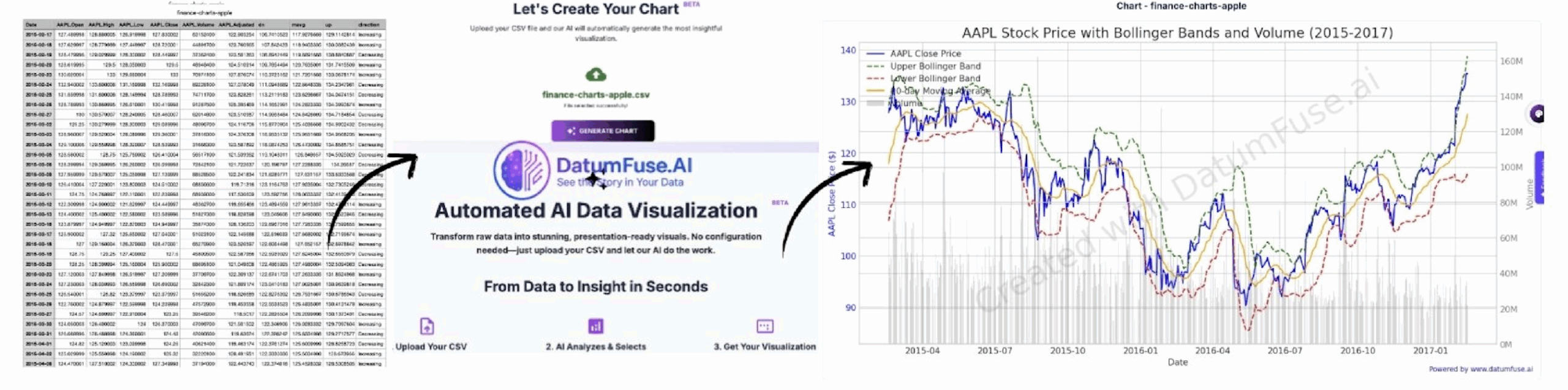
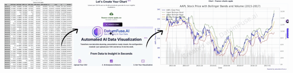
How It Works: A 3-Step Workflow
DatumFuse.AI is designed for maximum simplicity.
- Upload Your CSV: Simply drag and drop your file into the interface.
- AI Analysis: The AI engine instantly analyzes the data, understands the columns, and selects the perfect chart.
- Get Your Chart: A high-quality, presentation-ready chart is generated and ready to download.
Conclusion: It’s Time to Work Smarter, Not Harder
DatumFuse.AI’s automated visualization tool is a significant leap forward for anyone who works with data. By transforming a cumbersome, multi-step process into a seamless, one-click solution, it empowers business professionals, analysts, and students to unlock insights with unparalleled speed.
Stop wasting time on chart creation and start focusing on what truly matters: understanding your data and making smarter decisions.
Ready to turn your CSV into a stunning chart in 10 seconds?
Try DatumFuse.ai for free today. No credit card required.